All our adhesive materials can be cut into various shapes. Choose from our standard shapes or supply us with a custom cutting file. On all our product pages, you'll find the option to choose your shape and size. Below is just a guide.
- Contact
- Orders
- Order Progress
- Reviews
- Shop by Material
- Foiled Labels – Foiled on A4 Sheets
- Fluorescent Labels
- Frosted Labels – Silver Etch Finish
- Gold Labels – Metallic Polished Finish
- Gold Labels – Metallic Satin Finish
- High Tack Waterproof Labels
- Laminated Durable Waterproof Vinyl Labels
- Resin Domed Labels
- Silver Labels – Metallic Polished Finish
- Silver Labels – Metallic Satin Finish
- Tamper Evident Labels
- Waterproof Labels – Vinyl
- Window Stickers – Static Cling
- Sticker Sheets – Kiss Cut
- Shop by Product
- Address Labels
- Asset Labels & Stickers
- Bakery Labels
- Barcode Labels
- Beard Oil Labels
- Beer Bottle Labels
- Bike Tyre Labels
- Boutique Labels
- Business Labels
- Candle Labels
- Café Labels
- Cosmetic Labels
- Custom Labels
- Cut Vinyl Transfers
- Die Cut Stickers
- Equipment Labels
- Jar Labels
- Logo Stickers
- Retail Price Labels
- Return Address Labels
- Sauce Labels
- Sticker Sheets – Kiss Cut
- Vape Labels
- Vinyl Labels
- Vitamin Supplement Labels
- Wedding Labels
- Water Bottle Labels
- Wheelie Bin Stickers
- Popular Content
No products in the cart.
Return To ShopFree shipping over £100
Artwork Guidelines
Setting up your artwork correctly
If you are not using our online designer, you will need to setup your artwork so that it’s suitable for printing.
Unfortunately it’s all too easy to send a file over that looks great on screen, only for unexpected results when you receive your labels. This is because screens do not show underlying problems in many files created by many applications today.
We have put to together an in-depth guide on how to create your label artwork so that it prints correctly. The prices that you find online are based on print ready artwork being supplied to us.
- File Formats
- What is Bleed?
- Colour / Quality
- Safe Margins
- White Ink Setup
- Foiling Setup
Adobe Indesign
Adobe Indesign is a page layout application which is perfect for designing label. This is our favourite application for designing as you can manage all content easily.
1. Setup
Create a new file, ensure you set it up as actual size. During the file setup you can add your bleed, we recommend 2mm minimum. You can also add inner safe margins, we recommend 2mm margins and keep all artwork inside them.
2. Design
When designing your document, ensure all important elements are kept within the 2mm margin guide that you have set in the last step. Anything that bleeds off the page needs to extend out to the red bleed margin. Ensure all elements are clear. We recommend minimum font sizes of 4pt. If you inport images, ensure they are not pixilated.
3. Saving
Save your Indesign document somewhere safe for later use, this is your editable file. Now export it as a PDF for print. You will need to choose the PDF settings from your menu when exporting. Use a high quality setting. Ensure you look through the PDF export options and include your bleed and also trim marks.
Adobe Illustrator
Adobe Illustrator is a vector design application perfect for drawing stickers and creating artwork for high quality print.
1. Setup
With the latest versions of Adobe Illustrator, you can have multiple artworks within a single file. We accept files with multiple artworks only if they are all sized on the appropriate sized pastboards. We do not accept multiple designs on a single pastboard. To setup your document correctly, ensure your pastboard is the final size of your label for each artwork. You can add bleed margins to each pastboard.
2. Design
Ensure all fonts are converted to outlines before you send us your files. You will need to embed any external images used otherwise they’ll be missing from your print. We can accept either the native *.AI file, or to make it easier you can save your designs as a *.PDF. Separate multiple artworks into different files only if the sizes are different. Do not submit to us files which have multiple artworks which differ in size/shape. Do not add any cut lines to your artwork as this can lead to multiple cuts being sent to our printers.
3. Saving
As mentioned earlier, you can either send us the original native illustrator file or convert it to a PDF. Illustrator files can be saved as a PDF and opened in Illustrator afterwards. We prefer a PDF as it saves any issues with embedding images. Please use the PDF settings supplied here to create any PDF. These setting ensure all elements of your design will be the best quality.
Adobe Photoshop
Adobe Photoshop is a raster/vector application used mainly to edit photography. Whilst it’s not the best application to design your labels, we’ll give you the information to get the best results.
1. Setup
With Photoshop being a raster/vector application there are some important steps when setting up your document.
First you need to choose your size, as Photoshop doesn’t allow things to pass the outside of the page (Bleed) you have to account for this when setting up your document. If you require a 50mm square label, you’d set your new file up at 54mm x 54mm.
This allows for 2mm of bleed on each edge. Obviously if you don’t have anything going off the edge of your design or a background colour, you can size to 50mm x 50mm.
2. Resolution & CMYK
This is a very important step with your Photoshop document, failure to do this will render your artwork useless for print. Once you have sized your new file to actual size, choose a resolution greater than 300ppi (pixals per inch).
If you have very small text, ensure this is a minimum of 600ppi. You cannot go back and do this after you have designed you label and it will only resample the artwork, not boost the quality.
Set your ducument colour-mode to CMYK. If you set-it to RGB at this stage, you’ll end up using colours that are not achievable using our CMYK printing process.
3. Saving
As mentioned earlier, you can either send us the original photoshop files or convert it to a PDF. Photoshop files can be saved as a PDF and opened in Photoshop afterwards. We prefer a PDF as it saves any issues with embedding images and fonts. Please use the PDF High Quality settings to create any PDF. These setting ensure all elements of your design will be the best quality.
What is Bleed?
If you have a background colour or have elemnts going off the edge of the label, you require bleed.
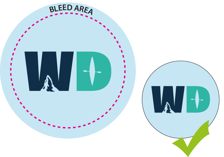
Bleed is a printing term that refers to printing that goes beyond the edge of the label before trimming. The bleed is the area to be trimmed off and it should not contain any parts that you want to appear on your labels. The bleed is the part on each side of a label that gives us a small amount of space to account for movement of the press and the cutting dies.
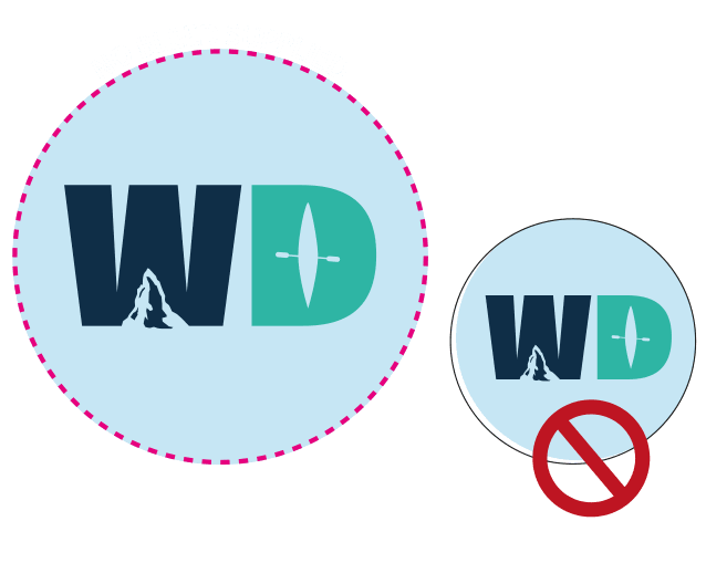
Artwork and background colours can extend into the bleed area. After the labels are trimmed, the bleed ensures that no unprinted edges occur in the final trimmed label.
It is very difficult to print exactly to the edge of a label so, to achieve this, it is necessary to print a slightly larger area than is needed and then trim the labels down to the required finished size and shape.
Images, background images and fills which are intended to extend to the edge of the label must be extended beyond the trimming line to give a bleed.
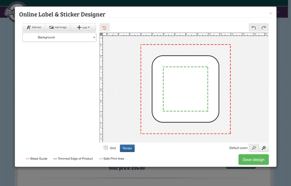
Unlike many online printing companies we have catered for bleed within our online designer. The area in-between the black and red lines on the design stage is the bleed area. You will see a fully cropped print preview on submission of artwork.
We ask that you supply all artwork with a 2mm bleed on each edge, this gives enough tolerance for any movement in the press, paper or cutter.
This is artwork with correct bleed
This is artwork without bleed
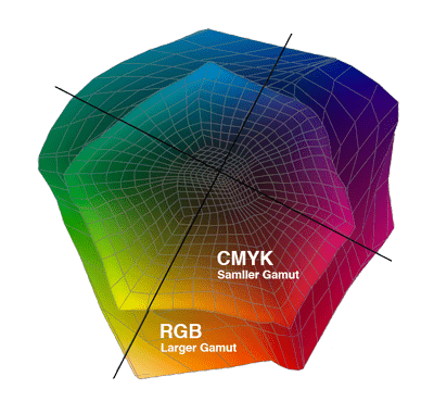
CMYK & RGB Explained
Your documents will be printed using a CMYK printing process. This stands for Cyan, Magenta, Yellow & Key, the Key being the Black. These four colours combine together to make up every colour that you see in your artwork when printed.
This process differs to how you see colours on the screen as those colours are made up from RGB. RGB stands for Red, Green & Blue. RGB is unlike CMYK as it’s made up from light rather than ink or coloured toner. This enables RGB colour to be more vibrant and appear more colourful.
RGB light, when combined together can create more vibrant colours than that of CMYK. This is because RGB light has a wider colour gamut than that of the CMYK Inks / Toners. There is a part of both the RGB and CMYK colour gamuts that overlap, meaning that a large part of each can be matched from screen to print.
For the parts where they do not overlap, this is where conversion comes in play. If you supply us with a file made up of RGB colours, we’ll need to convert it to CMYK colour for printing. If there are any colours in your RGB file that appear outside of the CMYK colour gamut, they will be converted to the nearest achievable colour in the CMYK gamut. This is done automatically by our dedicated software for the closest match.
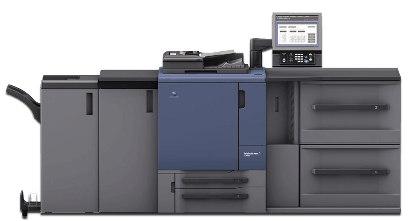
Calibration - Monitors and Print
Let’s be honest, what you see is not always what you will get….
We’ll explain why!
Lets start with monitors…
The monitors in our offices are 27″ and at a 5K resolution, each one run under daylight bulbs to avoid any miss-calibration. They cost over £1500 each and we have one for each user, calibrated weekly by spectrophotometer.
Don’t worry, we’re not boasting, we’re telling you because it would be unlikely that you have the same hi-end production setup in your home office, with the same level of calibration.
Lets face it, most people have a monitor/tablet/phone that they will approve their proofs on. Just so we’re clear, the majority of these devices have never been calibrated professionally and will not give accurate colour, just a representation at best.
So what can we do?
Apart from you driving/flying/train’ing to our office to see the run on the press there isn’t an awful lot we can do.
The accuracy level of the print industry cannot be translated across the web from screen to screen, printer to printer. Anyone who tells you different is lying.
All we can do is give you the best chance of getting artwork similar to your screen. In order for this to happen, you need to follow our artwork guidelines. Following these will give you the very best chance of getting accuracy across the web, from screen to print.
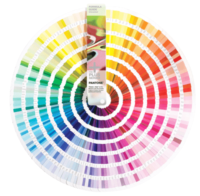
Pantone ® colour
The best colour matching system used by printers & designers worldwide
We only match to Pantone colours. Please don’t ask us to match your curtains, your lipstick or anything other than a Pantone swatch colour.
PLEASE DO NOT USE TRANSPARENCY EFFECTS WITH PANTONE COLOURS, RESULTS WHEN PRINTING IN CMYK CAN BE UNPREDICTABLE.
This is your responsibility as we do not charge you to go through your artwork with a fine toothcombe to rectify any issues, we print as is and the result can be different from the proof we send you.
How do I use them?
If you are asking that question, we recommend that you source a graphic designer to produce your artwork. Unless you have a Pantone swatch book to hand, it would be pointless using the colours in your artwork. Imagine a paint swatch in your local homeware store, it tells you the colour of paint in each tin. If you have no swatch, you’d be guessing the exact colour using the label on the tin, not ideal or accurate.
When you have an artwork setup with Pantone colours, please be aware that we print to the CMYK Bridge book, so the CMYK equivalent of the Pantone colour. Our presses have Pantone matching built in, but only a minority of Pantone colours can be matched on a digital CMYK press. If you require Pantone colours not achievable in the CMYK range, we would advise having your labels printed lithographically (more expensive, set-up fees etc).
What are Safe Margins?
Keep your important elements safe.
We’re not going to tell you how to design your labels, but we would suggest to take note of the items on this page to get best results. Take a look at the examples on this page, we’ll let you make your own mind up whether or not to add items close to the edge of the label.
If we were able to perfectly print any design we would obviously do that, unfortunately manufacturer tolerances don’t allow us to do so.
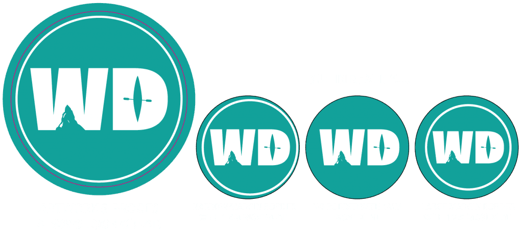
What is tolerance?
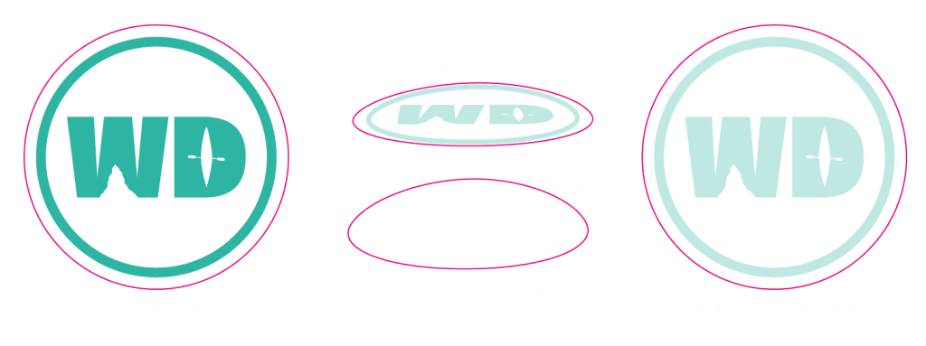
Despite our best efforts, there will always be slight movement on the press when printing your labels. Our printers are capable of accurate, repeatable results but they do have a small tolerance for movement. This tolerance is at maximum 1mm. Imagine a round label with a border just 1mm inside from the labels edge. If when printing there is 1mm of movement, this border would be flush against one side and 2mm in from the other, making the label look uneven. The smaller the label, the more uneven it looks. To avoid this issue we ask you to design your labels without borders if possible and if you are to use them then allow a 2mm gap between your border and the labels edge.
Best practice
The tolerance with movement can be based on many factors. Paper stretch caused by humidity, machine temperature, manufacturing tolerances etc etc. We print hundreds of thousands of labels each week, we see all different kinds of artwork and results. We can honestly say, with over 20 years of experience in printing that borders do not necessarily add value to your labels, if anything the chance of them looking uneven devalues them. This isn’t something that effect just our business, nearly 100% of machine suppliers will give you a manufacturing tolerance of at least 1mm. We’re just the ones being honest about it to avoid disappointment.
White Ink Printing - Setup Instructions
If you are ordering clear/frosted labels from us, you might need to setup a white ink layer.
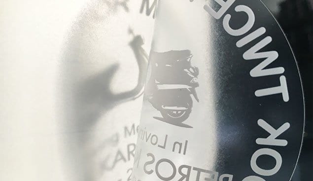
Our CMYK inks when printed are slightly translucent, this is fine when sticking your clear stickers onto light coloured surfaces but it’s a problem for dark surfaces. Light surfaces act just as a sheet of paper does, creating contrast to the colours and helping them stand out.
Dark surfaces don’t do this, they absorb the colours into them making them difficult to see due to lack of contrast. Please see image examples.
White Spot Channel Setup
Whatever application you are working in, you will need an application that supports spot colours. Vector applications are the most popular, such as Adobe illustrator & Corel Draw. You cannot setup your artwork for white ink printing in Photoshop without being a guru in it. No matter what application you use, you will need to follow a few rules to get the intended results.
- – Avoid using transparency
- – Flatten your artwork
- – White ink cannot be overlaid, it needs to be the bottom layer.
Instructions
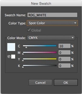
If you have white ink beneath some elements but you require white ink on top of some elements too, you will essentially need to produce some complex artwork. Work with 2 layers, bottom one being the white ink layer only and the layer above for your CMYK artwork. Your task will be to get your artwork looking exactly as you want printed without putting any white ink onto the CMYK artwork layer. This involves punching out elements on the CMYK artwork layer so the white beneath shines up through. Failure to do this will produced mixed and unpredictable results. It’s your responsibility to ensure your artwork is setup as per this guide as it might not necessarily show up on your proof. Please use the spot colour setting in the image provided.
Designing your foiled labels
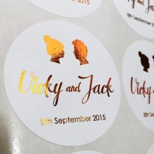
- Design your labels in Black and White only. Ensure the black isn’t a tint of grey. We will foil the black areas of the artwork.
- Ensure you have a positive image, not a negative one. For instance a black logo or text on a white background is fine, whereas a white logo or text on a black background isn’t.
- Ensure no black is touching the edge of the labels, 2mm safe margin.
- Avoid large solid areas of black (foil) where possible.
Please note that there is slightly more movement on the press than usual due to the foiling processes. We advise not to put borders too close to the edge of the sheet as could make your labels look uneven. You have been warned! 🙂
